I've been thinking quite a bit about the design of resources since attending Amir Arezoo's workshop at #mathsconf5, and I did promise a more in-depth post at some point, so I figured that Terminator/Skeleton was as good an excuse as any. The workshop was titled 'Design Cues for Great Resources' - I do love excellent quality teaching resources, and making teaching materials is one of my big passions, so signing up seemed like a no-brainer.
(I apologise in advance for the atrocious quality of the images in this post - by Workshop 3, my phone had properly died, so I was taking these using my tablet, which isn't the greatest...)
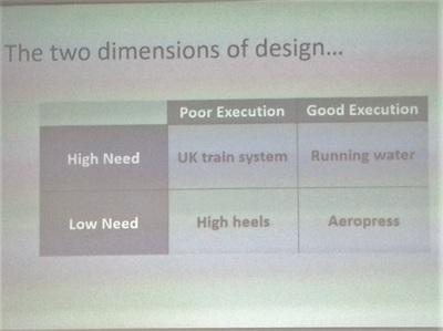
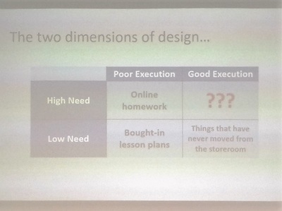
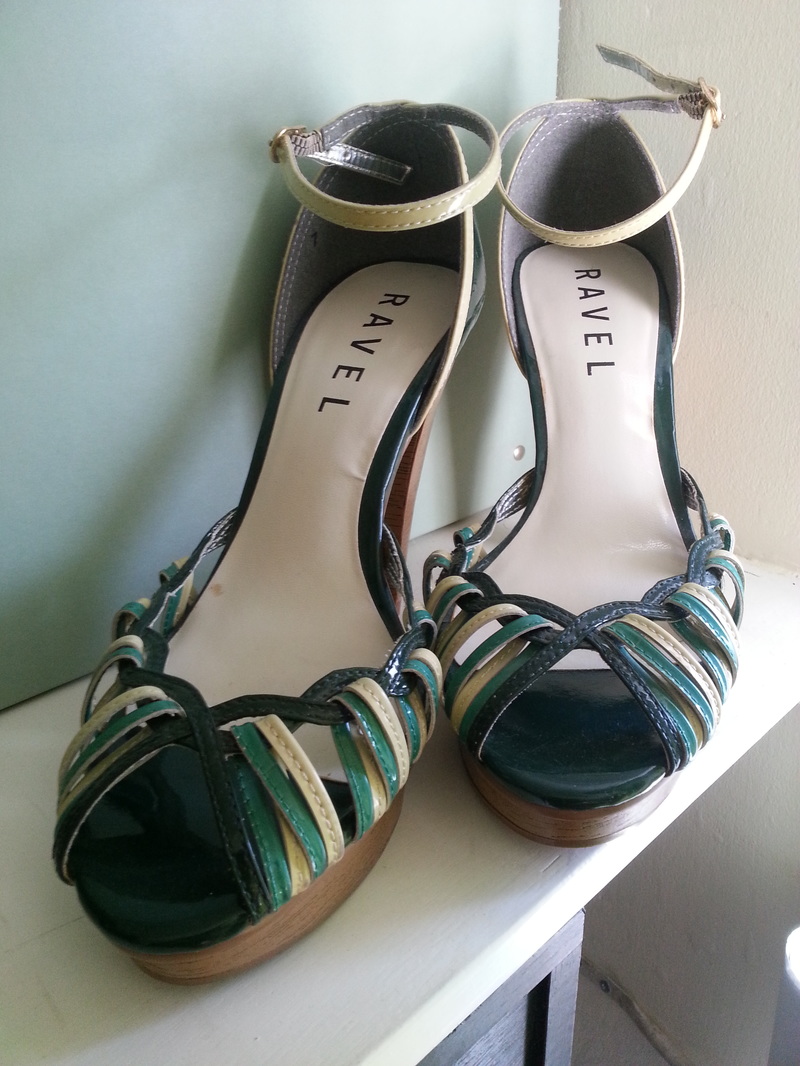
Something that I felt had implications for me, both as a teacher and a sharer of resources was the classification of bought-in lesson plans in that Poor/Low box. The parallel with high heels is so perfect that I had to break off typing this to go and take a picture of this pair of shoes.
|
I saw these in TKMaxx about four years ago. I tried them on - they were a little high, but I thought I could cope. At a price of less than £10, I decided they were too beautiful to leave in the shop.
They have sat in that position on a shelf in my house since about a week after I bought them - I'm lucky that they're green, and complement my lounge so well, otherwise they'd have gone in a box in my wardrobe long ago. I physically cannot wear them for longer than about five minutes, not because they make my feet hurt, but because they are so high that I end up walking like a baby giraffe, completely contrary to the chic, sophisticated look I was after. |
Every year I try to save complete lessons or even topics on my computer, thinking that I can just use that lesson as it is next year, but inevitably end up pulling it apart, reshuffling, adding in or taking away as appropriate. This year I've started saving tasks rather than lessons, which has made planning much, much easier, and any of my new uploads on here will be organised in a similar way.
The key features that Amir highlighted were:
- Colour
- Typeface
- Use of spacing/formatting
- Imagery
Badly spaced or formatted question sets really annoy me - consistently modelling the correct way to write a fraction seems a little pointless when a resource insists on writing it as 1/3 rather than placing the numerator above the denominator (yes, I'm annoyed now that I can't do it properly on here either!).
I use questions on the whiteboard far more frequently than I use textbooks, because it's much easier to set exactly the work that you want to - I think it's incredibly important to space questions so that pupils aren't confronted by an intimidating wall of words or symbols. Twenty questions looks far more approachable in two neatly-spaced columns of ten than in one squashed list of twenty.
Typeface is another big one for me; although I genuinely do not understand the hate for Comic Sans in teaching resources, I know that a lot of people really don't like it, so I'm designing a lot of my newer (shared) resources in a less contentious font. I did agree with Amir's point about consistency of font use - too many different fonts on a resource, and it starts to look confusing and cluttered.
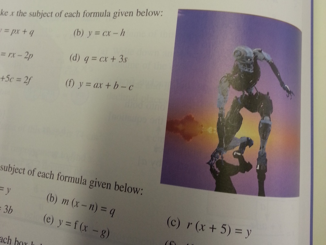
The thorny issue of images brings us back to the picture at the start of this post - I'm a firm believer that images, unless directly relevant to the topic you're teaching, or adding something to the instruction, need to stay firmly off teaching resources. In my experience, rather than engage pupils, they actually create more distraction as pupils either a) end up thinking about or processing features of the image, rather than the mathematics or b) get completely distracted and start talking / thinking about wider contexts. I used a resource once that had a Simpsons character on the plenary slide... never again. The resource was superb, but about half the class got distracted by Bart at the chalkboard, and I then had to pull them back to the task again.
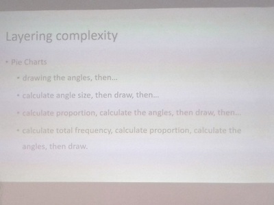
I really want to try this approach to teaching pie charts, and also start to look for other areas where complexity can be layered gradually, rather than giving a long method for pupils to try to follow all at once. I think this is done naturally to some extent with topics such as solving equations (begin with one-step, then move to two-step, then unknowns both sides), but I'm going to keep my eyes open for other content areas I can try this.
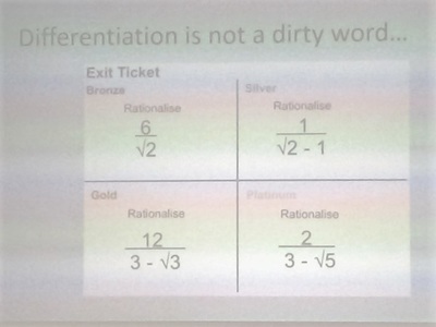
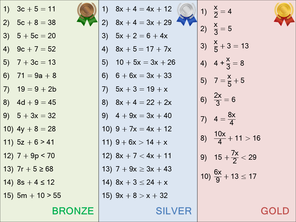
Finally, the idea of using bronze, silver and gold to differentiate rather than red, amber, green has already made its way into my teaching. Our move to some mixed ability this year means an increased amount of differentiation, with some pupils consistently working on what I used to call the "red" activity. It's not made a perceptible difference in the classroom, but I certainly feel much better talking about "the bronze questions" rather than "the red questions". Here's one I used for linear equations and inequalities this week:
 RSS Feed
